Introduction:
It would be likening the importance of safeguarding people to the creation of car seatbelts and stating that user experience plays a significant role in responsive theme design.
Put simply, it's the main reason why it exists and the factor that ought to weigh heavily in every design decision.
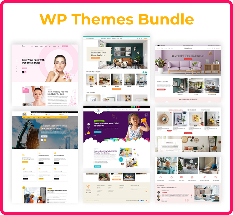
Naturally, it starts with the foundations of responsive design, such as grids, break points, and other elements that let themes reorganise themselves according to the user's device's size and position.
It also extends much farther, though. In the end, an installation of WordPress that modifies its layout when accessed on a mobile device, resulting in clutter and difficulty navigating, will merely encourage users to swiftly press the home button.
How does mobile-responsive web design work:
Responsive Design , at that time, refers to a design and style that looks great on a variety of devices, big and small. Customers and consumers surf various websites for particular reasons because mobile devices and other small gadgets are portable.
Websites with a set width for desktops were once designed by web developers. But after then, individuals started using new gadgets with a wide range of screen sizes. These days, it's essential to design web sites that work correctly on a range of screens and devices.
The growing number of internet users who use mobile devices has made responsive web design more important. The website ought to adapt immediately to the user's shift from a laptop to an iPad in terms of resolution, image size, or scripting capabilities. For a better viewing experience, responsive web design dynamically reorganises your website's various content parts into a column that is vertical once more. That's what web design that is responsive for mobile devices is.
How Does User Experience Affect Business:
We use the phrase "user experience," or UX for short, to refer to every aspect of a visitor's interaction and involvement with your online presence.
The ultimate objective of any internet site, regardless of whether it's being run as an eCommerce store, a service-based business, or just a blog, is going to be identical: to generate leads.
Make those who visit feel at ease, so they will feel compelled to do anything that you want people to do, such as purchasing a product, subscribing to your email list, and requesting additional information. You have to make sure that each interaction is constructive if you want to achieve it.
After all, interacting with a website ought to be a quick, enjoyable, and easy way for users to achieve what they want. This is exactly what UX design seeks to do.
The Effect of UX Design on Responsive Themes:
Consistency is the main function of UX design in Responsive Design. The theme ought to be capable of adjusting to the screen size of any device, be it a desktop, laptop, tablet, cell phone, or other, and provide an optimal experience regardless of whether the user is viewing the site in a landscape or portrait orientation.
When a website visitor views it on a smaller iPhone screen, they shouldn't experience any of the issues that frequently arise with poorly constructed responsive themes, like pages that require a lot of scrolling or zooming through and out to find everything, images that obscure important text material, and broken interactive components.
Rather, the iPhone consumer wants to be able to utilise the same level of intuitive ease when navigating to the items, operations, or data they require as when using a desktop computer.
The Relevance of User Experience in Responsive Theme Design:
The best responsive themes include those that effectively match the needs of the user with the objectives of the web page, achieving the former by satisfying the latter.
The first step in all of this is to have a thorough understanding of the market, type of business, and niche that this topic is intended to fill. This involves obtaining useful knowledge about the target audience for the website. After all, industry-specific differences exist in terms of customer wants and corporate objectives.
For instance, selling as many things as possible is a business owner's main goal in eCommerce. Whether customers are using a smartphone or another device, they can find the goods they're looking for easily and quickly, and they are able to finish the checkout process without any issues, putting them in an improved position to accomplish that goal.
The requirements of an entrepreneur wishing to hire a marketing expert using their website are nothing at all the same as those needs.
For instance, buying as many things as possible is a business owner's main goal in eCommerce. If consumers are using a smartphone or another device, they can find the goods they're looking for quickly and easily, and they can complete the checkout process without any issues, putting them in an advantageous position to accomplish that goal.
The needs of an owner of a small company seeking to hire a marketing expert using a website are nothing at all the same as those needs. Thus, the first step in creating any design is to determine the intended consumer by asking significant inquiries. To state it in distinct ways:
How Requirements of Visitors Affect Design: An Example:
You might not realise how important any of this is. Let's take an example where a life insurance firm has a website that is intended to produce leads and sales of new policies. If that is the case, it is reasonable to suppose that a sizable portion of the audience will be older.
Additionally, there's a good chance that the older audience will have vision impairments or other problems that make it more difficult for them to use the website. This could have an impact on the accessibility choices the designer made regarding layout, typography, and colour scheme.
Other Important Priorities for Creating Good UX in Responsive Theme Design:
- Design Consistency:
As we've already mentioned, a great user interface (UX) should provide a consistently intuitive experience across all platforms. But it's crucial to recognize the extent to which this also applies when creating responsive themes.
Firstly, design components such as typefaces, colour schemes, and visual content ought to be identical across all platforms because this may reassure and excite visitors.
For example, depending on the situation at hand, users frequently access the websites they frequently use on multiple devices, such as a cell phone with Android at home in the middle of the night and a desktop machine at work.
It's probable that a user will believe they've landed in the incorrect location or have unintentionally considered a bogus website created by scammers if a website's design in general varies substantially between platforms.
Responsive designs should prioritise making sure that the same functions are available across all screen sizes and configurations while maintaining a consistent design.
A user ought to be able to utilise a tool, buy a product, or complete a form on their cell phone without affecting overall functionality when they can do it on a desktop computer.
The days when you used an unwieldy mouse that was linked to a desktop machine to engage with sites are long gone.
Now that more and more individuals own tablets and cell phones with touchscreens, interacting with websites with a stylus and fingers is common. The larger target on the Call to Action links is only one example of the touch-friendly components that responsive theme designers need to take into account.
Sustaining a consistent content structure is crucial for improving user experiences that support groups in reaching their goals.
Every page should load with the most significant information and features first, followed promptly by the next most critical thing, and so on, until the user gets access to whatever they require from that page.
For instance, on an eCommerce page, this would entail having an accurate product job title, price, an overview of the main features and advantages, and an add-to-cart click at the top of the screen, with more supporting information—like customer reviews and longer product descriptions—coming later.
This reduces the time required for consumers to decide whether to buy and gives them the kind of satisfying experience that is probably going to result in a sale.
The Advantages of Improving User Experiences with WordPress Themes That Are Responsive:
After reading the previous substance, you ought to be able to understand why responsive theme design places such a high value on user experiences. A user is more likely to stay on and even return to a visually appealing and user-friendly website, building the kind of lasting devotion that can result in increased engagement and conversion rates.
The website owner's business will greatly benefit from this, and as a result, they are more inclined to trust the person from whom they purchased the design elements and use them again later on when they need to build a new website.
But user design affects more than simply what a person sees when they visit a website. Additionally, it's the actual procedure that brought those visitors to the internet page in the first place. Usability is a crucial aspect of efficient search engine optimization, yet it is often overlooked.
Google ranks mobile-first websites higher in search results because it enjoys seeing websites that provide great user experiences across all platforms. Additionally, Google prefers sites that load quickly, particularly when seen on mobile devices. Clean, minimal code, built-in lazy loading, and as few requests via HTTP as feasible when designing responsive themes can all help improve site performance, which can result in clients who are happier, lesser bounce rates, and possibly even an improvement in SERP (Search Engine Result Page) rank.
Conclusion:
As the primary driver behind responsive theme design and a vital consideration in all design choices, the user experience (UX) plays a pivotal role in this process. The goal of the design of the user experience is to put visitors at ease and entice them to engage with your website. Generating leads is the ultimate goal of every website, be it an e-commerce site, a business that relies on services, or just a blog. Consistency is the primary purpose of UX design for adaptable themes. Regardless of the user's orientation, the subject matter should be able to adapt to the screen dimensions of any device and offer the best possible experience. For instance, a user visiting a website on their smaller iPhone screen shouldn't run into problems with scrolling, graphics covering up text, or faulty interactive elements. The most effective responsive themes balance the goals of the website with the requirements of the user, fulfilling the latter while assisting with the former. Having a solid understanding of market conditions, business model, and niche is essential to achieving this.
This involves acquiring relevant details about the website's intended audience. Regarding consumer tastes and business goals, there are variations depending on the industry. Customers may quickly and easily find things on smartphones and other electronic devices when shopping online, for example, and they can easily finish the checkout process without any issues. Any design process starts with identifying the target market through important questioning. As an example, the website of a life insurance company might cater mainly to senior citizens and people with vision problems, which might impact accessibility decisions made about layout, typeface, and colour scheme. Design consistency is one of the other important requirements for producing a strong user experience in responsive theme design. An excellent user experience (UX) should offer a continuously intuitive experience with fonts, schemes of colour, and visual information that is consistent across all platforms. Visitors will feel reassured and excited by this, especially if they regularly access the site on several devices.
Functionality and features are given emphasis in responsive designs, which guarantee that customers may access tools, make decisions, and fill out forms on their portable devices with no loss in overall functionality. User interaction requires touch-friendly elements, including greater goals on Call to Action links. Maintaining a uniform content structure is essential for enhancing user experiences since it helps organisations accomplish their objectives. For example, the most crucial information must load first on an eCommerce page, then the next most crucial item. As a result, consumers have a more positive experience and need less time to determine whether to purchase.
FAQ:
What are all three main elements that comprise responsive design? The media query, the web web browser, and a responsive web interface are the three main parts of a responsive website.
Many problems with your website can be resolved with the help of responsive design. It will boost the amount of time users spend on your site, make it more mobile-friendly, and improve its appearance on big as well as tiny screens. Additionally, it might assist you in raising your search engine rankings.
The process of creating a website that is mobile-friendly and changes according to the visitor's device—a desktop, tablet, or smartphone—is known as responsive web design. To enable customers to navigate websites within the limitations of their devices, developers utilise media queries within CSS to establish breaks for every screen size.
Designing websites that adapt to the user's device is referred to as responsive website design, or RWD. Regardless of which device it is viewed on, an internet page ought to have the best possible look and functionality.
Whether the information is being viewed on a smartphone, tablet phone, television, or watch, responsive website design, or RWD, is a design technique that takes into consideration the variety of media and device sizes and allows the content to automatically adjust to the screen. Rather than being a stand-alone technology, a responsive website is a methodology.
