Introduction:
Have you ever examined a website on your mobile device only to discover that the layout was so jumbled up that it was difficult to navigate? This is an everyday issue that a lot of owners of websites deal with, particularly as more people utilise the internet on mobile devices.
Given that most internet users visit webpages through mobile devices, it is essential to have a responsive design for the website in order to provide a consistent user experience on all platforms. The simplest way to do this is to use responsive themes, which rapidly modify a website's layout and style to fit the screen size of any mobile device.
Having a website that is mobile-responsive is not only a luxury but also a need in the modern digital world. You may be losing out on a great deal of traffic and potential clients when your website is not mobile-friendly. This post will discuss responsive themes and their significance in providing a consistent and user-friendly website experience across all platforms.
What is a WordPress Responsive Theme:
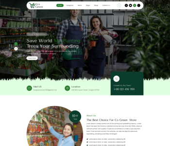
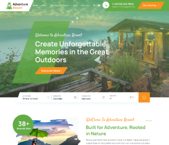
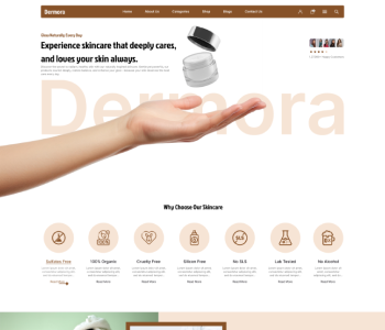
Similar to any other regular themes a responsive theme for WordPress can automatically modify the content and images on the website based on the device and screen size. It enhances the manner in which users interact with your website.
The precursor of mobile web design, which is responsive design:
Before web design that is responsive became the industry standard for developing websites that worked on a variety of gadgets, web developers would often use the terms mobile web creation, website's mode, such as mobile, desktop, and tablet. These are basically the same as adaptive web design; the objective is to ensure that websites function correctly in terms of arrangement, content (the material and media), and overall efficiency on platforms with varying physical attributes (display size, resolution).
The main distinctions are related to the devices in issue and the technologies that can be used to provide solutions:
While there are now many various kinds of devices available, including website's mode, such as mobile, desktop, and tablet and more, we used to only talk about desktop and mobile. We have to create websites defensively to account for typical screen sizes and resolutions in addition to unknowns, as opposed to just a few different sizes of screen.
In the past, mobile devices had minimal CPU, GPU, and bandwidth capacities. Because some devices did not support HTML or CSS at all, it was usual practice to use server-side computer sniffing to identify the type of device and browser before providing an internet page that the device could manage. As long as there are still issues with battery life and bandwidth, you should employ the techniques covered in this article to provide mobile consumers with an enjoyable experience.
Another consideration is the user experience. Instead of seeing a 3D animated globe with flight patterns and your company history, a mobile visitor to a travel website might simply want to verify flight timings and delay information. But responsive design strategies can help with this. [For the purpose of developing responsive experiences, modern technologies are far superior.] For instance, relevant media can now be supplied to various devices without the need for techniques like server-side sniffing because of responsive image and media platforms.
Presenting responsive web design:
HTML is inherently fluid, or responsive. The browser will consequently reflow the content to fit the window's width if you build a page on the internet with simple HTML and no CSS and then resize your window.
Even though the default reactive behaviour appears to be sufficient, it can be challenging to read lengthy sections of text that are full-screen on a large monitor. When someone narrows their internet Explorer window and visits the website on a mobile device, the website may appear squashed when the wide screen length of lines is decreased using CSS, for example, by adding columns and the heaviest padding. Setting a fixed length to create a non-resizable web page also doesn't work; on small devices, it leads to scroll bars, while on large displays, it causes too much white space.
Whether the information is being viewed on a smartphone, tablet phone, television, or watch, a responsive website, or RWD, is a design technique that takes into account the variety of devices and gadget sizes and allows the content to adapt itself to the screen.
Rather than being an independent technology, responsive website design is a strategy. The term adaptability refers to a collection of best practices utilised when creating a layout that adapts to the type of device that is used to view the information.
Setting a fixed height and width to create a non-resizable web page also doesn't work; on small devices, it leads to scroll bars, while on big screens, it creates too much white space. Whether the data is being viewed on a smartphone, tablet phone, television, or watch, responsive website design, or RWD, is an approach to design that takes into consideration the variety of devices and tablet sizes and allows the content to adapt itself to the screen.
Rather than being a stand-alone technology, responsive website design is a strategy. This term refers to an assortment of best practices applied when creating a design that change the type of device that is used to view the information being presented.
Using media queries, we may apply CSS to layout the website according to the user's demands by running a number of tests (such as determining if the user's monitor is wider than a given width or resolution).
The media query that follows, for example, checks to see if the viewport is no less than 80 rem wide and that the present website is being presented as screen media, not a paper copy. Only in a situation where both of those requirements meet the criteria will the CSS for the container selector be put into effect.
A stylesheet allows you to add several media queries, and you can adjust your layout whole or within sections to best fit various sizes of screens. Breakpoints are the places where the layout is altered and a media query is inserted.
When utilising Media Queries, a typical method is to start with a basic single-column style for devices with narrow screens (like mobile phones), verify for broader screens, and then, after you are certain that you have a sufficient screen width to support it, implement a multiple-column design. Mobile-first design is the process of designing first for mobile devices.
When creating media query breakpoints, best practices suggest utilising relative units instead of the exact sizes of a single device. Using queries related to style sheets according to browser size ranges is one way to approach the styles set within the media question block; another is to use custom properties variables just to hold values linked with each breakpoint. See the Media Queries MDN documentation for more details.
RWD can benefit from media inquiries, but they are not required. Queries are not necessary when employing flexible grids, related units, and the minimum and maximum unit numbers.
Because Custom Theme websites are built using flexible grids, you can stop stressing about designing pixel-perfect layouts for every conceivable device size.
When the content starts to seem poor, users can add a breakpoint, remove a feature, and update the design through the use of a flexible grid. For instance, you can utilise columns to make sure line lengths aren't rendered unreadable as long as screen size rises, as well as create a breakpoint to prevent a box from getting crushed with two words on every single line as it gets narrower.
Many layout techniques are responsive by default, such as Flexbox, Grid, and Multiple-Column Layout. They all provide you with easier options to design a flexible grid, if that's what you're seeking to achieve.
When using multicol, you may specify the maximum number of columns into which you wish your material to be divided by providing a column count. The size of each of these next gets determined by the browser and varies depending on the screen size.
You are defining a minimum width if you choose to define a column width instead. When creating columns, the browser will divide up the available space between each column and generate as many of that length as will fit within the container without being excessively small. As a result, the number of rows will vary according to the available floor space.
To provide an appropriate column width and a maximum number of columns, use the columns shortcut. By doing this, developers can make sure that line lengths don't get too tiny and illegible when the screen size gets smaller or bigger.
Flexbox components can expand and contract, distributing space amongst them based on the capacity of the containers in which they fit. You can instruct the items on how to respond to increased and decreased space surrounding them by changing the flex-grow and flex-shrink values.
As mentioned in the Custom Theme of the topic, Flexbox: Flexible size of flex items: the flex items displayed in the example below will all occupy the same amount of room in the flex containers if you use the shorthand of flex: 1.
The fr unit in CSS Grid Design enables the allocation of available space among grid tracks. The grid structure with three rows of tracks at 1 ft. is created in the following example. Three column tracks will result from this, each taking up some of the container's available capacity.
To ensure that media never exceeds its responsive box, the next technique can be employed:
This ensures that media never fill up their containers to the brim. By downloading more photos than necessary, using a single huge image and scaling them down to fit on tiny gadgets wastes bandwidth.
Responsive images cater to user viewport and device resolution using element and size attributes. They provide multiple sizes and "hints" for optimal viewing. The browser selects the best image for each device, ensuring the user receives the appropriate size. This feature allows targeting images with varying aspect ratios and art direct images at different sizes.
Responsive typography:
The term "responsive typography" refers to altering the font size within media queries and adjusting the viewport unit size to accommodate varying screen sizes. Media queries are used to create responsive typography.
We want to set the level 1 heading in this example to be 4rem, which means it will be four times the dimensions of the base font. That heading is quite huge! We construct a smaller heading first, followed by employing media queries to completely replace it with the bigger one if we know that the consumer has a screen resolution of at least 1200px. This way, we only want the jumbo heading on larger screens.
Using the aforementioned strategy, we have modified the responsive grid instance to incorporate responsive type as well.
Any element can be modified with them to make it look better and more useful at different screen sizes.
Without using media inquiries to establish break points, responsive typography can easily be enabled with viewport units. When you specify your font size with vw, it will always match the size of the viewport because 1 vw is equivalent to one percentage point of the viewport width
The issue with doing this is that since the text is always based on the viewport's size, the user is no longer able to zoom in on any content set using the VW unit. As a result, you should never use viewing units alone to set text.
There is an alternative, and it calls for the use of calc(). The text will remain zoomable if you add the VW unit to an integer set that uses a fixed size, like ems or rems. In simple terms, the zoomed value is improved by the VW unit:
This implies that rather than setting the font size for mobile and then changing it in our media queries, we only must set it once for the header. The typeface then becomes larger as the viewport's size grows.
A responsive page's section typically includes a viewport meta element that scales content to 100% of its size and sets its viewport width to the device's width. This is necessary because viewport width is often overestimated by mobile browsers. This meta tag was created to prevent websites from being overly optimised for smartphones. To ensure proper functionality, media queries and breakpoint-based responsive design should be adjusted to the device's real width.
Conclusion:
A website or application that adapts to the screen environment is said to have a Custom Theme. It now essentially constitutes our default method of building websites and incorporates an array of CSS and HTML features and strategies. Think about the web pages you frequent on your phone. It is probably rare that you come across an internet address that is just the desktop version on a smaller screen or that requires you to scroll laterally in order to find items. This is a result of the web shifting towards responsive design.
The layout techniques you have learned in these classes have also made it much simpler to create Custom Theme Designs. Relative to the early days of mobile-first design, there are a lot more tools at your disposal if you are new to web development. For that reason, it is important to ascertain the age of everything that you use. Even though the old articles are still valuable, creating attractive as well as useful designs is much easier when CSS and HTML are used in the current way, regardless of the device the user is using to view the site.